


In the weeks leading up to Eudon Choi's A/W show, the designer leaked sneak previews of the inspiration behind his latest collection. Scenes from Dr Zhivago, Russian folk costumes and collaborations with Swarovski and milliner Piers Atkinson were unexpected influences for a designer that, in quite a short time, has defined a style of architectural lines, smooth textures and a generally minimal style. But everything came together on the catwalk, with Choi's clean lines present in mannish coats, cocoon capes and the strong folds of the long dirndl skirts. The floral embroidery on the striped pieces were obvious references to traditional dress, but the pink sequins and crystals on the knitwear unfortunately seemed out of place. Jacquards, stripes and colour brought a more suitable playfulness to the collection, which really hit home with Piers Atkinsons' dramatic headpieces of beautiful blooms and furry pom poms, which also covered the ankles on Joanne Stoker heels.


Another anticipated show on the relatively quiet first day was Kokon To Zai, or KTZ, a brand that has found success on the street and catwalk, with the aesthetics of a modern day Westwood. This season look to witchcraft and the art of tarot, the latter used for strong prints, first in monochrome, and later in blue, red and gold. Wide-brimmed hats, pleated leather skirts and floor length coats may have been obvious references to the women of Wicca, but they're also pieces that will blend effortlessly into the wardrobes of the label's loyal fans.


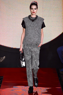
The dark mood continued into the second day at Somerset House, with David Koma presenting a collection heavy on black leather, with punches of red, nude and pale blue. Circular, quilted black leather shapes created modern silhouettes and shapes, fresher than their inspiration of vinyl records. They varied from oversized shawl collars, to flared mini skirts and structured peplums, stretching to metallic and glistening prints. There was plenty of skin on show, with sporty lines and racer backs to accentuate the athletic body Koma dressed for Spring with his tennis-inspired collection.


Dark colours, leather and music are all things synonymous with designer Todd Lynn, showing the same day. But this season marked a change in direction, with much simpler, cleaner shapes and lines. Outerwear was semi-fitted as opposed to his usual second-skin tailoring, some jackets even sporting soft folds at the waist. His love of fur was not as evident this time, largely overtaken by several pieces in goatskin- a smoother alternative, in unexpected shades of electric blue to break the colour palette of
black, putty and nude.


Clean lines are nothing new to J JS Lee, one of London's new wave of minimalist designers. Pale colours were fitting to the pared-back style, white and cream followed by pale blue and pink/purple. Straight lines were emphasized by long layers, ribbed knits and exaggerated steps at the back of skirts and dresses. The black looks were kept clean in light synthetic fabrics that had a slight sheen, some decorated with woven black squares.


The Sister by Sibling show was more theatrical, channeling the energy of the design trio's muse this season, Paula Yates. Floral twinsets worthy of a housewife were given the Sibling treatment, blotched with giant black polka dots, while hand-knitted hats and scarves grew and grew until you could barely see the models' faces. Colourways of pink, blue and turqouise, along with short lengths and peekaboo flashes of skin made sure the knitwear was never traditional, even when in a Fair Isle pattern. A striking red leopard print and fur accessories gave crafted pieces a luxe edge.

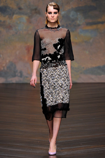
Holly Fulton's collection was also inspired by a woman of the eighties, this time French actress Beatrice Dalle, known for her kooky characters. Fulton's prints remained Art Deco in style, rows of red lipsticks standing tall like skyscrapers while window pane chevrons came painted in more garish eighties shades. Fulton's thought process was clear in the braided sashes of military jackets popular in the decade, recreated in gentle black loops printed down a shirt, along trouser legs, and on to the later look's floor length skirt of organza, reappearing again in a skirt suit. The embroidery and applique that was so strong in her SS13 show was used again, this time on leather instead of plastic. A black and white suit (above right) was strong in a simple way, the top covered with the speckled feathers of a guinea fowl, the trousers printed in the same monochrome pattern.


Preen's Spring collection combined femininity with unexpected materials like snakeskin, and was spotted on a number of industry folk in the days leading up to and during the fashion weeks. Fall had a lot to live up to, and the brand once again delivered, this time using mannish shapes, with a focus on texture. Straight lines in the tailoring were emphasized with exposed zips and outlines in contrast colours, taking full advantage of contrasting colours of red and black, previously seen in the David Koma and Holly Fulton shows. Embellishment of tiny black beads with graphic white stars decorated the starting looks, followed by a tartan digital print that verged on dowdy, thankfully replaced by a lively leopard print that pixellated into nothingness. The contrast of serious shapes and playful colours worked well, but the final looks of floral beading were confusing, having no relationship with the initial ideas.


There were some confusing moments in the Paul Smith show too, where minidresses and some separates printed with Baroque interiors looked to have become lost from another show. His precise tailoring and clever use of colour was also present, thank God, along with a striped print that fitted in well with his aesthetic. Smith's continuity has always been his strength, despite some critics suggesting he should 'mix it up'. Maybe the blips in this show will silence them.


Jonathan Saunders added yet another disappointing show to the line-up of day three, presenting a collection that lacked his usual energy. The show kicking off with looks appliques with motifs of leather and vinyl, the prints that started his success being near non-existant throughout. The wools and earthy tones of the first half looked dowdy in the womanly shapes that formed the basis of the collection, it being inspired the pin-ups of the fifties and sixties. An injection of colour halfway was a relief- scarlet, powder blue, aquamarine and bright orange were signs of the Saunders we love and missed.


Perhaps he swapped places with Mary Katrantzou this season, she having taken over the throne of London, kingdom of prints, which this season descended into melancholy, casting away the playful colours that have dominated her past collection. Prints of lone figures on dark roads, glowing lamps in darkness, steel bridges and bare trees against a white sky created a dark palette of black, grey and white, broken by painterly dabs of blue and some metallic prints, painting us a more contrary Mary. Shapes were architectural, verging on Oriental, with many reminiscent of the straight folds of origami and kimonos. Many were dramatic yet wearable, but others just seemed to be created to facilitate the prints, often not artfully done at that.


Holly Fulton's collection was also inspired by a woman of the eighties, this time French actress Beatrice Dalle, known for her kooky characters. Fulton's prints remained Art Deco in style, rows of red lipsticks standing tall like skyscrapers while window pane chevrons came painted in more garish eighties shades. Fulton's thought process was clear in the braided sashes of military jackets popular in the decade, recreated in gentle black loops printed down a shirt, along trouser legs, and on to the later look's floor length skirt of organza, reappearing again in a skirt suit. The embroidery and applique that was so strong in her SS13 show was used again, this time on leather instead of plastic. A black and white suit (above right) was strong in a simple way, the top covered with the speckled feathers of a guinea fowl, the trousers printed in the same monochrome pattern.


There were some confusing moments in the Paul Smith show too, where minidresses and some separates printed with Baroque interiors looked to have become lost from another show. His precise tailoring and clever use of colour was also present, thank God, along with a striped print that fitted in well with his aesthetic. Smith's continuity has always been his strength, despite some critics suggesting he should 'mix it up'. Maybe the blips in this show will silence them.


Jonathan Saunders added yet another disappointing show to the line-up of day three, presenting a collection that lacked his usual energy. The show kicking off with looks appliques with motifs of leather and vinyl, the prints that started his success being near non-existant throughout. The wools and earthy tones of the first half looked dowdy in the womanly shapes that formed the basis of the collection, it being inspired the pin-ups of the fifties and sixties. An injection of colour halfway was a relief- scarlet, powder blue, aquamarine and bright orange were signs of the Saunders we love and missed.


Perhaps he swapped places with Mary Katrantzou this season, she having taken over the throne of London, kingdom of prints, which this season descended into melancholy, casting away the playful colours that have dominated her past collection. Prints of lone figures on dark roads, glowing lamps in darkness, steel bridges and bare trees against a white sky created a dark palette of black, grey and white, broken by painterly dabs of blue and some metallic prints, painting us a more contrary Mary. Shapes were architectural, verging on Oriental, with many reminiscent of the straight folds of origami and kimonos. Many were dramatic yet wearable, but others just seemed to be created to facilitate the prints, often not artfully done at that.


Form is something Marios Schwab is a dab hand at, if you forget his Spring 2010 collection that is. The fit of his most recent collection was spot on again, this time it was the colour and fabrics that faltered. Fitted dresses skimmed the body, with motifs designed by Tunisian artist Nja Mahdaoui following the lines of the hips to accentuate the female form. Capes made looks suitable for fall, as did the colour palette of beige, burgundy and taupe, although overall, it made the collection seem a little lacklustre. Schwab's gowns is something he has become known for, thanks to his continued sponsorship from Swarovoski, but one in wine chiffon over purple and pink sequins didn't quite hit the spot, something heavy velvet piping made sure of.


The fourth day of LFW began with Peter Pilotto, a label much-involved in giving the city its reputation for print design in recent seasons. But designers Pilotto and De Vos did not rely on their authority in print this season, experimenting with shape and adding embroidery, knit and embellishment to their colourful bag of tricks. Powerful shapes presented a strong woman, sharp shoulders nodded to the eighties, perhaps pushing the silhouette too far at times with some even dropping over the arm, adding much bulk to boxy bodies. Skirts were generally slim, often sporting the label's signature digital prints which appeared in embroidered and knitted guises to strong effect, bold lines of colour zig-zagging throughout to break the pattern. Sequins also appeared in what could be mistaken for print from afar, just another example of the design duo's clever ways of building on their beginnings, yet always keeping us on our toes.


Another of London's bright lights, Michael van der Ham, is known for putting beautiful fabrics together in artful collage with dibs and dabs of sparkle for a lady with an edge. The style continued this season, with more of an edge. The first half lacked the embellished touch, colour and texture taking the form of ingenious inside-out jacquards, with patterns that reminded me of recent collections at Kenzo, coming in dark greens and blues, livened with acidic orange and lime green. Knit added to texture, presumably inspired from the designer's recent collaboration with Brora, as did frayed chiffon peaking from beneath structured tops with clever cut-outs. Metal bullion embellishment and delicate white embroidery on black chiffon formed the basis of cocktail and evening wear later, bringing the whole collection together to show this star won't be fading soon.


London's more established master of texture and colour, Erdem Moralioglu, also mixed things up this season, going with the darkening mood. The show began dominated by black boucle, lightened with touches of sheer tulle and the addition of delicate single feathers. Erdem's favoured florals began to creep in, blurred in sequins, like Monet's Waterlilies seeped in black ink. He continued his creative clash of ladylike and the unexpected, wrapping a dress of beautiful pink ostrich feathers with black tulle, painting lilac blooms on black leather and cutting polka dots into the same skin. Despite usually avoiding black, Erdem excelled this season, the only flaws, surprisingly, were some brighter florals that looked out of place in this gothic garden.


The show schedule creeped up the ladder of success, next presenting PPR's latest acquisition, Christopher Kane. The new backers brought fresh pressure to deliver, and the opening looks didn't silence doubts with a silhouette of broadened shoulders, flats chest and dropped hips of widening pleats. Things quickly changed, with a graphic camo print reminding us of Kane's sense of fun, followed by a modern take on lace, flowers blown in proportion to take on Art Nouveau references, especially when styled with matching silver jewellery. Creativity continued to blossom with large flowers edged with feathers, followed my a seemingly unconnected embroidered and beaded scan of the human brain, seen on organza tops and dresses. The creativity here was unquestionable, but 61 looks lent to much repetition, perhaps because of his new finances, which might also be to blame for the questionable and regrettable number of flashy fur pieces throughout.


The trend for animal skin thats started in New York stayed strong at Burberry Prorsum, with plenty of leopard print and pony skin to go with the kinky inspiration of 1960's showgirl Christine Keeler. Rubber and latex added to the idea of sex appeal, cut into the classic shapes we're used to seeing from Christopher Bailey. Fit floundered when he tried to mix things up, noticeably in a bustier shape (above right). The addition of chrome love hearts to otherwise plain pieces was also questionable, leaving us to wish that Bailey just stick to what he knows best.


After showing recent collections at small, private presentations, this season saw a dramatic return to the runway for the iconic Tom Ford. And so he created a collection fit for the setting, perfect for the photographers, inviting gasps from the audience. Entitled 'Cross Country Multi Ethnic', which loosely translated as 'anything goes', it included all mediums of the glitz and glamour Ford is known for- skins of zebras and leopards, sequinned florals, black lace and fringe, magenta fur and purple ponyskin. There was undeniably a prevalence of bad taste, but the statement pieces are sure to suit playful editorials, while the sleek tailored pieces and alluring lace will appeal to Ford's distinguished customer.
Photos from Style.com
No comments:
Post a Comment